Capstone: Improving Voter Equity in St. Louis
Introduction
Since the 1960’s, the law of the land in the United States has been “one man, one vote.” For a myriad of reasons, this ideal has been deferred, watered down, subverted or otherwise compromised. However, one thing we can do to improve equity in voting rights is to expand participation for those who have a legal right to vote.
In the city of St. Louis, my hometown, Voter Equity is no laughing matter. The city of St. Louis’ data department used data from the 2016 election to determine that voters in Majority White (MW) wards were 30% more likely to vote than voters in Majority Black (MB) wards. What this 1.3x disparity means for representation and policy outcomes is obvious. If voting equity were a reality, over 15,000 more votes from MB wards would have been cast in that election.
Additionally, compared to its neighboring counties, the City of St. Louis has the 2nd lowest voter registration rate, again, concentrated in MB wards.
Therefore, in order to increase voter equity in the city of St. Louis, this project proposes using Foursquare location data to predict where 501c3 and municipal efforts should be directed at registering and turning out voters for elections.
Data
In addition to leveraging data available from Foursquare’s Places API, this report will use open source data from the city of St. Louis, the city of St. Louis Election Board, the Missouri Secretary of State, and the US Census.
The table found here https://en.wikipedia.org/wiki/List_of_neighborhoods_of_St.Louis conveniently provides the demographic information we need.
An additional table, here https://en.wikipedia.org/wiki/Board_of_Aldermen_of_the_City_of_St.Louis Helps to complete the picture. Each of the 28 wards lists the parts of the constituent neighborhoods.
Step one is to identify the neighborhoods where we need to focus on. St. Louis’ unique geography helps here; The city is conveniently divided into two sides (North Side & South Side) bifurcated by a central corridor. We will not use ward boundaries because first, wards change every 10 years as a result of census results and second the Board of Alderman are going from 28 to 14 members.
As a shortcut (and to underscore the lasting legacy of segregation) to understand St. Louis, in 2010 the north side was 94.0% Black, 3.7% White, 0.2% Native American/Alaska Native, 0.2% Asian, 1.5% Two or More Races and 0.5% Some Other Race. 1.1% of the population was of Hispanic or Latino origin.
In 2010 the central corridor was 35.0% Black, 55.4% White, 0.2% Native American/Alaska Native, 6.4% Asian, 2.2% Two or More Races, and 0.7% Some Other Race. 2.8% of the population was of Hispanic or Latino origin.
In 2010 the south side was 26.0% black, 65.4% white, 0.3% Native American/Alaska Native, 3.3% Asian, 3.0% Two or More Races, and 2.0% Some Other Race. 5.3% of the population was of Hispanic or Latino origin.
Exceptions exist however, and ward geography is not 1:1 the same as neighborhood delination.
We will take the demographic data and sort by % of Black residents. Our further analysis will focus on exploring these neighborhoods.
Our next step is to conduct an exploratory analysis of these wards, similar to this course’s New York neighborhoods project.
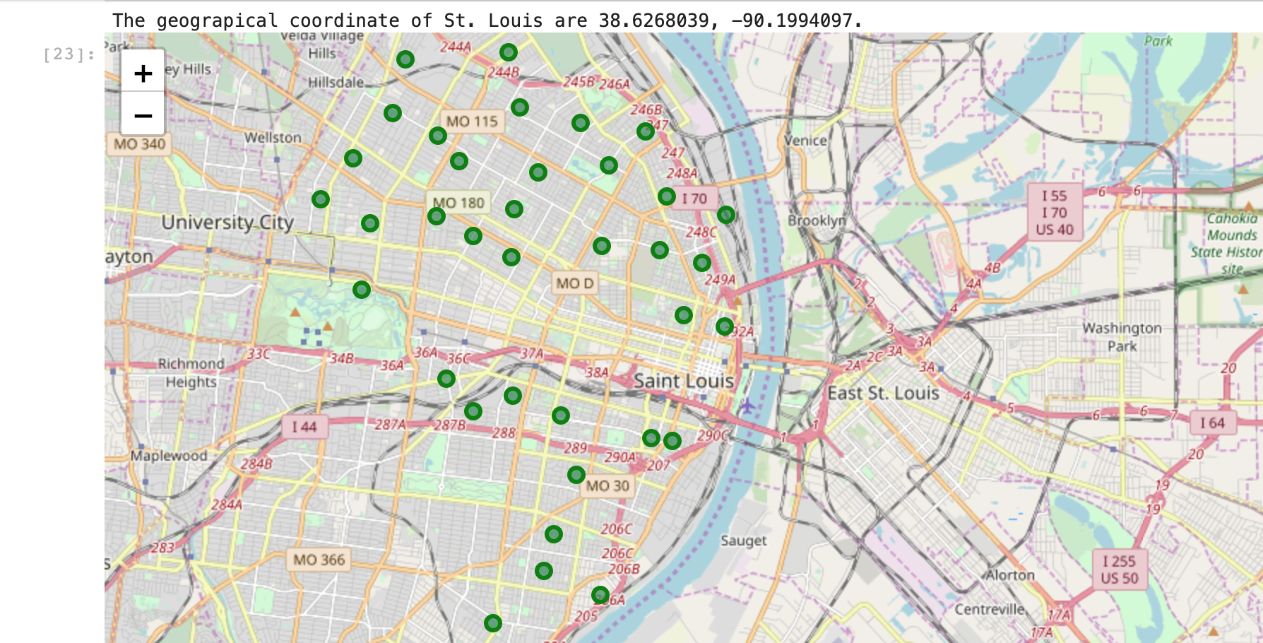
In this step, we’ll create a Pandas dataframe with neighborhood, latitude and longitude. We’ll create a map of St. Louis using Folium, with our focus neighborhoods superimposed on top. Then we’ll get the top 100 venues within a 400m radius of each neighborhood by creating a function for this, and get the category data for later segmentation.
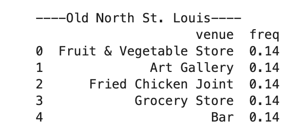
We’ll create a dataframe that lists the top 5 venues for each neighborhood in MB wards. In other words, these are the places that people already go to. These locations would be the logical starting point for organizations and civic workers to build relationships with to encourage civic participation. However, we also need to understand trends here - in case new establishments rise up.
To better understand the trends of venues in each neighborhood, we’ll use Venue Category to help.
With Venue Category available, we’ll one-hot encode and then group rows by neighborhood and by taking the mean of the frequency of occurrence of each category. We’ll print and then transform into a data frame the 5 most frequently occuring venue categories. This data gives campaign planners something to look for in developing new relationships and programs.
Finally, we’ll use KMeans clustering to group the most similar neighborhoods (by Venue Category) together.
Methodology
First we’ll scrape the Neighborhood list for relevant data. We’ll create a dataframe for all the neighborhoods with their demographic data, then drop all the neighborhoods with a % of black less than 50%.
We’ll use geocoder to obtain latitude and longitude coordinates for each neighborhood and join that to our demographic dataframe. Then using folium we get a map like this:
From here we will request up to 100 venues from the Foursquare API per neighborhood within 400m of the neighborhood. We then use one hot encoding and the venue_category attribute to obtain a dataframe of the frequency of each category of venue in each neighborhood.
Just to have a useful list of these frequencies, we’ve printed them out like this:
We’re going to sort and obtain the top 5 most common venues in each neighborhood, and then begin our KMeans clustering.
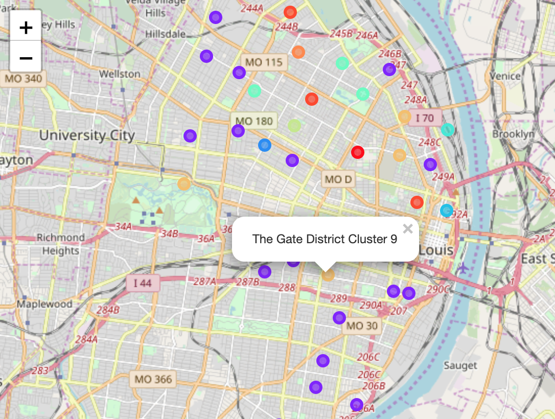
Finally, using folium, we can generate a map of the clustered neighborhoods.
Discussion
In examining the clusters further, we can identify several trends. First, that in manually choosing the amount of clusters, there was plenty of trial and error. This is a methodological drawback to KMeans clustering, however, it still helped here to really understand the defining characteristics of each cluster.
Cluster 9 is obviously centered around St. Louis’ parks. An effective strategy would leverage the ongoing programming in those parks to find partners and opportunities for crowd appeals.
Conversely, cluster 1 is dominated by restaurants and other places where people will actually sit and congregate in small groups. Here, one on one interaction would seem intrusive, and barring renting out some of these places, rallies might seem odd. Multiple different rapport techniques will have to be used to work with these proprietors in order to build an effective coalition.
The other clusters each present unique challenges for organizing, and may require task-force like effort to effect meaningful change.
Conclusion
Civic and political campaigns have long relied upon voter files and predictive modeling to identify individual voters (or potential voters) for calls to action and support. However, the individual theory of civic engagement is fundamentally incomplete: while we all enter the voting booth on our own, the neighborhood that the polling place is in, and the community of voters surrounding that polling place shapes who gets to the ballot in the first place.
By bringing in venue data from Foursquare, we’ve been able to cluster these neighborhoods on the basis of the places where people go. In other words, we’ve identified the centers of gravity for community organizing. Employing a venue based strategy offers a hidden benefit.
Voter files are only as good as their latest data. Because the precise targets we’re trying to reach are infrequent or non-voters, voter file managers have an understandably difficult time getting data about them into the file and keeping their information up to date, especially compared to an every elections voter.
By removing the need to track each voter individually and focus instead on programming with stable community partners, less error or wasted effort is introduced.
An additional thought: Experienced organizers and longtime residents may not actually find anything new in this report. This makes sense; the report is less about uncovering some hidden understanding than to make explicit the implicit wisdom gained through many contact hours in the field.
Organizing is a profession with high burnout rates, chronic under-resourcing, and short tenures in most locations. It is rare to meet community activists who’ve been able to make the kinds of years and decades long efforts to erode or eradicate stubborn problems like gaps in voter equity. The ultimate worth of reports and analysis like this is to facilitate a faster time to effectiveness for organizers and campaigns who are not privliged enough to have deep human expertise to rely upon. If this model for neighborhood based organizing using venue data can help a campaign more effectively distribute their limited resources, that’s an outstanding result in the author’s opinion.